
 |
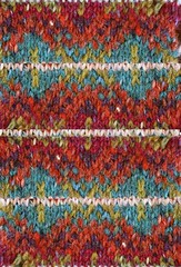 |
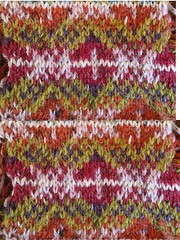
| #1 | #2 |
I’ve knit up a couple swatches for Road to Golden (and enlarged them with some Photoshop help).
There are things I like about both of these swatches. #1 is my favorite of the two, but I do like parts of the other as well.
I think #2 needs a non-white color for that single line that goes across it. And, the orange and red (even though they’re never next to each other) create a muddiness rather than a distinct line.
I may try one or two more swatches before casting on. I want to make sure I get this right!


I really like no.1. I think the pattern becomes too lost in no.2 because the colours are so dark and perhaps similar in depth or whatever the correct term is. Can’t wait to see how this all develops.
I love seeing your process. You have an understanding for combining color for Fair Isle, that I don’t grasp and seeing your process is great. I really like #1 of the two, though I still think #2 is quite nice.
That was fast! I vote for #1. Good color balance.
Those swatches make my head spin! They are so gorgeous – I can’t wait to see your progress on the sweater. Good luck! (oh, and I also prefer no. 1… by a hair…)
I think that number 2 wants more of that dark blue or purple for the horizontal line.
I agree with Colleen. I was going to suggest dark blue or purple for the white line myself and saw she already had. And for the red and orange muddiness, is there another shade in that family you could use that would put some shade distance between the two?
Either way, I still prefer #2. It’s not as crisp looking as 1, but I like the colors better.
#2 caught my eye right away, but that’s probably because I’m a freak for turquoise these days. So interesting how the pattern looks completely different with different color choices.
I wonder if you can incorporate some of the turquoise into swatch one? It really is eye-catching in #2.
Either way, I’m going to really enjoy watching you knit this!
Damn, damn, double damn. This is the only pattern – just this one – that I really liked form the current issue of Knit Scene. Sigh – I will have to live through your knitting. Good luck! Oh, number two, by the way since that is what you were after, not my ranting.
so pretty! i’d have a hard time committing to a color palate for this pattern – soooo many possibilities…
WHoa! You are really committed to this one. I like #2, but it needs something…
This is very exciting!
Hmmm….yeah. #1 if you’re going for the clearly marked pattern. #2 is too mottled. The stripe stands out far too much and the pattern gets lost in the sea of orange. I’d probably choose a much darker colour for the central horizontal stripe and the vertical line in the center of the diamond shapes. Maybe a dark brown.
Yarn play is such fun, isn’t it?
Blessings!
I agree that the pattern is much clearer in #1 too. If you like the colors in 2, maybe relatives that aren’t so close in value across hues?
The pattern is much clearer in #1. It’s blurred, not as apparent in #2. How fun to watch the process of picking colors!
Wow, you *are* fast! What beautiful swatches. I love the white in number 1 for this pattern, it’s fresh. But I also really love the orange and turquoise in number two but agree that it comes across muddy. The pattern in number 1 comes across so well! It’d be neat to have a little of the turquoise shot through it.
Your swatches are gorgeous. I love the teal in #2 but I know what you mean about the white line. The pattern definition in #1 is so much sharper, too. Perhaps a combination of the two?
I agree that #1 is the better of the two. It’s just so much clearer!
I do like the light blue in #2, but something about that white line is just to harsh maybe….i’ll have to see what you come up with next!
i like #1 too
I just love the teal in #2. But I agree with you about the white stripe and the orange/red being too close to each other.
good lord, woman. i’ve said it before: your patience amazes me. i could never be patient enough to swatch that kind of detail!
I love #1. The colors just seem to meld together perfectly so you don’t see the lines of stitches, you see the pattern. I think you’re right with #2, that white line doesn’t work. What if you just took it out completely?
no. 1 all the way!!
Have you tried using a teleidoscope? I’ve never used one, but I’ve heard it’s useful when figuring out how colors look together.
Really enjoyed looking at your work. Good stuff.
Oh, I do like #1! I’m interested to see how the tweaked #2 comes out, though.
But I seem to remember someone saying they were going to do “just one swatch, after lunch.” Hmmm.
Have you tried changing the swatches to black & white/grayscale? Sometimes that helps with picking colors in the sense of whether you want something with more contrast or less contrast.
Yummy. I love seeing the process.
Oh my gosh, both swatches look absolutely awesome and inspiring. But well… I’d vote for #1!